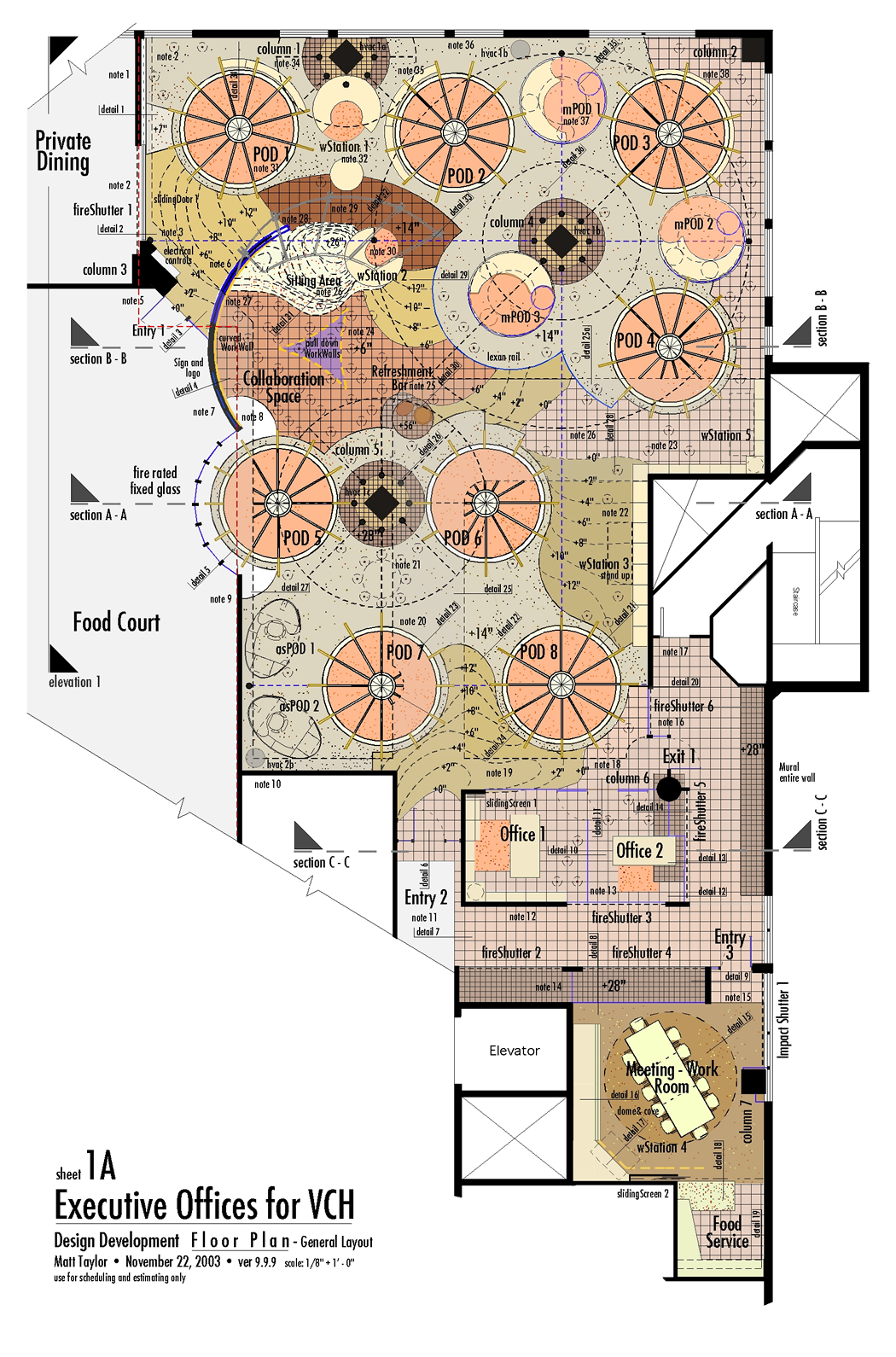
Note:
updated December 4,
2003 @ 11:56 pm
New material added: March 26, 2007 |
 |
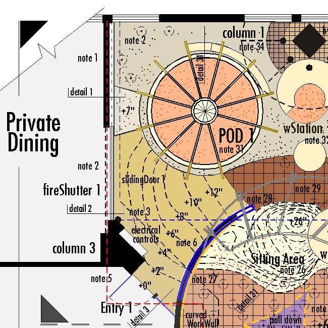 |
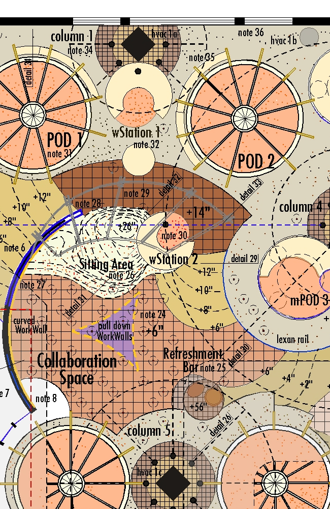
| note
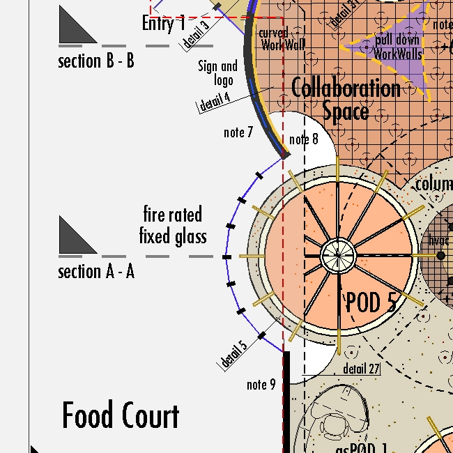
1: the interior wall finish will be the same
a now exists in the Dining and Food Court areas with
the
exception of the curved wall which will have a contrasting
and distinct color and sign. note 2:
This section of the environment has two important access
points: slidingDoor
1 to
and from the Private Dining Room and Entry
1 opening
to the food court. Both these send a signal as well
as provides
convenient access [link].
The sliding door will be assembled with wood, trim
and pattern to match the sliding screens on the PODs;
it will, however, be built of half inch Lexan for security
[detail
2] and run all the way to the 9 foot soffit
- it will be bolt locked at the sill.
fireShutter 1 will provide a two hour
separation between the areas. The red line indicates
the original demising line between the Executive Offices
and the Dining and Food Court areas. note 3:
relocate the electrical panes to a furred out space
on Column
3 and provide 12v switches for all lights
in the Executive Offices except those associated with
individual work
areas. wStation 2 will control lights
to the Collaboration
Space. note 5: The Entry
Door to be aluminum framed with glass, glass sidelight
and transom - 2 hour rated. |
|
|
 |
| notes
6 & 7: the new curved wall proceeds
from the red demising line at POD 5 and
slopes upward past Entry
1 - see elevation 1 and section
B-B. Fire-rated fixed-glass closes the
gap between the steel-stud and sheet rock wall
and the 9 ft. hung ceiling (food Court side) and
soffit (Executive Office side) per detail
4 - see section A-A, below. Entry
1 sidelight
has aluminum trim at head, sill and door jamb -
at the intersection with
curved wall the jamb is trim-less and dies flush
into the wall per detail 3 with
flush glazing strip. note
8: the Food Court floor finish proceeds
under the sill of the curved fire-rated
fixed-glass,
per detail 5, until it terminates
at the raised (14 inch) base of POD 5 and
the raised tile floor (6 inches) of the Collaboration
Space per detail 27.
POD 5, 6 & 7 are
partially “cut” by soffit and hung ceiling at the
9 foot level
- their wood and
lexan enclosed dome tops to be scribed into
the resulting horizontal and vertical surfaces.
A sprinkler head into the bottom surface of the
center of each POD is to be provided. See section
A-A, below. note 9: this portion
of the existing wall from the from the curved glass
onward to remain
as is. See elevation 1 for location
of the VUC
Executive Offices Sign and Logo. |
|
|
 |
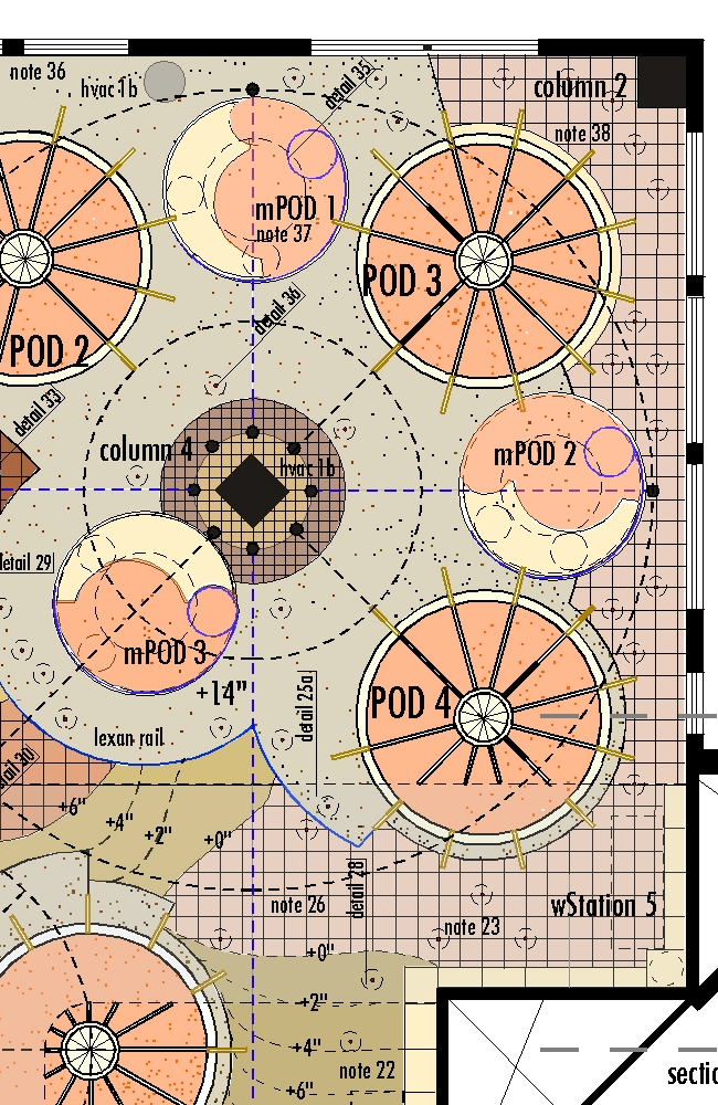
| note
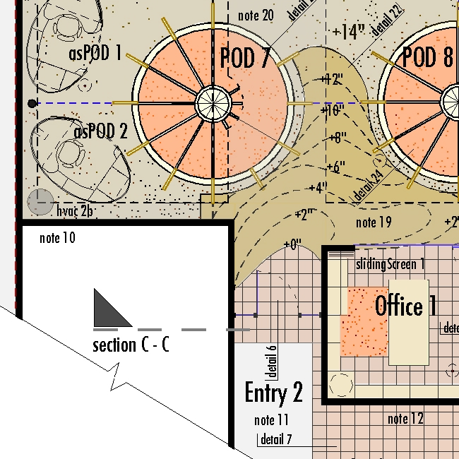
10: hvac 2b is vertical
duct from the overhead system to raised floor
feeding horizontal
ducts (on the existing slab) suppling PODS
5, 6, 7 & 8.
hvac1b (between columns
1 & 2) feeds PODS
1, 2,
3 & 4; (note
36).
asPOD 1 & asPOD 2 are
rolling, opening/closing workstations that are
feed electrical,
telcom, etc. from various
places in the environment [link].
Note 20: the shaded area indicates
the hung ceiling to create a chase area for
existing ducts,
conduits and cable trays. The sides of this hung
ceiling are stepped out on the vertical plane to
accommodate lighting and planters (see section
A-A, below and detail 25).
note 12: finish the two-hour rated
steel-stud and sheet-rock wall By Entry
2 and in the the Fire
Exit Hallway to match existing finishes
and colors in the immediate areas. note
19: the
dashed “contour” lines indicate the
sloped floor from the flat tile flooring
to the
“cement-earth” built-up level. Slope
is 2 inches per foot; surface is broken
tile
laid over light-weight fill with a cement/sand
surface to receive the tile. Entry 2 to
match materials and detailing of Entry
1. detail 6 (at door)
and detail
7 (at
opening) shows transition between existing
flooring and new 12 x 12 inch tile. Dashed
blue line,
between POD 7 & 8,
indicates horizontal Armature. |
|
|
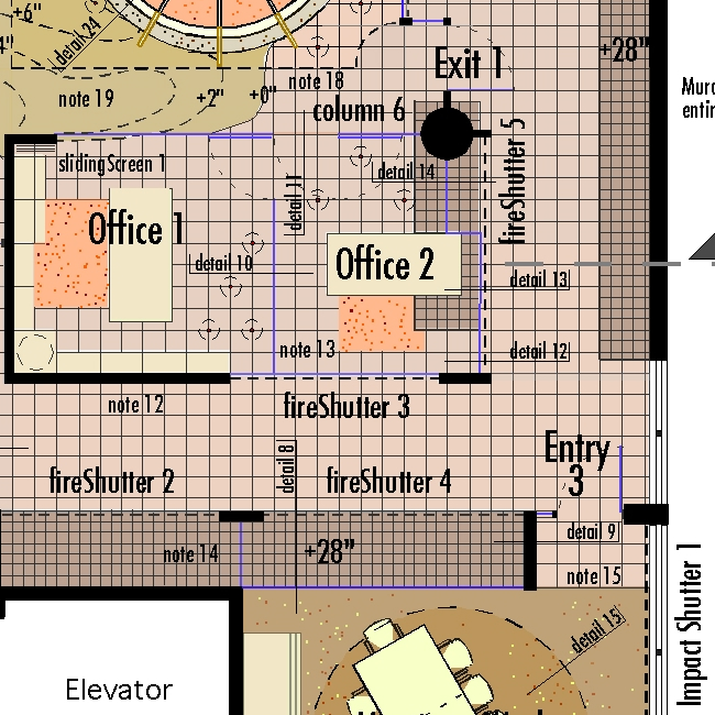 |
| slidingScreen
1 to match pattern of POD screens (except
height is the full 9 feet to the soffit). note
13: all
glass walls and doors in this area are without
mullions and recessed at the sill into the tile
floor or raised area, at the head into the hung
ceiling
and into the steel stud/sheet rock walls at the
jambs
-
detail
10,
11, 12,13 & 14.
fireShutter 2, 3,
4, 5 & 6 to
provide 2 hour protection to the Fire Exit hallway.
The orange-speckled tone is cork flooring to match
that used in the PODs and miniPODS - it is to be
set flush with the tile flooring surface. Some
kind of edge detail (wood or metal) is required.
Entry 3 to match Entry
1 and 2 detailing. note
14: the built-up tile surface (gray) is
28 inches high; steel stud and two hour-rated sheet-rock
entirely enclosed and covered with 6 x 6 tile.
This is similar to the bases at Columns
1, 4 &
5 creating a surface for potted
plants. detail 9: 2 x 6 steel
stud with two-hour rated sheet-rock. note
15: wood or metal edge detail between
the 12 x 12 tile and the natural fiber carpet.to
match the tile to cork detail in Office
1 and 2. In Office
2, provide
lateral files and drawers under the raised tile
area adjacent to the the work top. At the raised
plant platform
and exterior wall, a wood, glass, mirror and
tile mural will be placed - from the platform to
the hung ceiling level. |
|
|
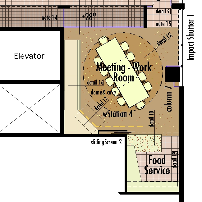 |
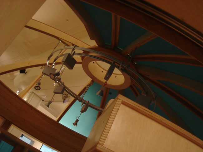
| detail
15: Dome and light cove similar to Continuum
in NYC [link] -
provide two lighting systems on dimmers. detail
16: double set of folding
WorkWalls (articulating) like those in the Hilton
Head knOwhere Store in
front of a storage cabinet. This cabinet to be
used for supplies and equipment related to catastrophe
work (I have an e-mail on these requirements).
detail 17: fold up workstation
to support multimedia projection (off of column
7 to pull down screen
(in front of WorkWalls) and catastrophe work. Impact
Shutter 1 is to protect the Meeting
- Work Room in catastrophe conditions.
column 7: to be detailed as a
floor to ceiling (9 feet) light (see blue lines)
- use 1/2 Lexan
to provide catastrophe protection. slidingScreen
2 to match screens in Office 1.
detail 18: cast colored concrete
serving surface. detail 19: wood
food service cabinets. Work table to be fixed in
place with electrical, telcom and data wiring to
the center module. Provide “flip-top” surface
- one for meeting and one for project work and
eating. the Food Service area to have, sink, under
counter refrigerator, coffee maker, sink, dishwasher,
microwave
oven, ice maker. |
|
|
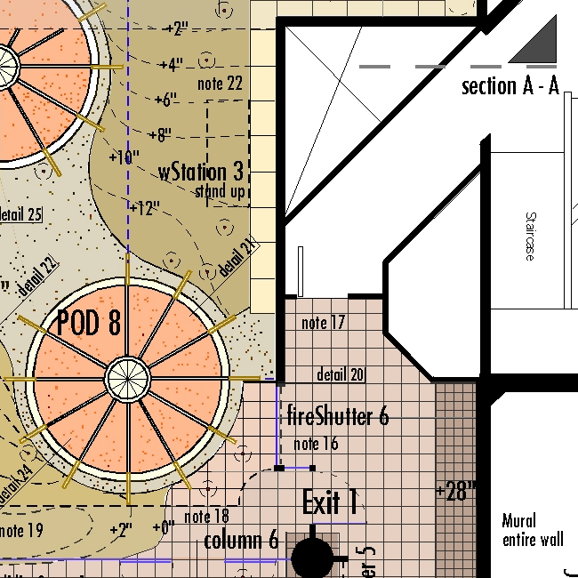 |
| Exit
1 materials and detailing to match Entry
1, &
2 and line up with the centerline
of Column 6 - I believe this column
is round and not square as shown on the orginal
plans; check this and diameter [link].
Provide steel-stud and sheet-rock “fins” at Column
6 to
receive the
door jamb and fireShutter 5 respectively. note
17: door to fire exit to remain as is.
note 16: fixed glass without mullion
or trim is typical of the area with fireShutter
6 providing
the fire-rating. detail 20: wall, fixed glass shutter
tile and a 14 inch level change come together
at this point - almost all elements of the grammar
from floor level to the ceiling. Start the detailing
process here. Field measurements will have to be
taken after the space is opened up to determine
how to establish the 1 foot by one foot module
of the tile floor and its many relationships. wStation
3 is a fold up standing height station
for document creation and production. note
18:
The 9ft height hung ceiling terminates with a quarter
round at Exit 1 mullion and side-light;
the trim detail (detail 1) then
continues around the the
full parameter wall with various wood, tile and
color finishes below and burnt umber paint above
it. |
|
|
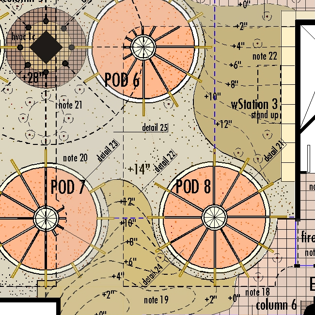 |
| note
20: The gray tone indicates the raised
(+14 inches) floor and curbs composed of cement
reinforced compacted
earth (alternatives are colored concrete slab
or tile) to be flush with the POD turntables and
cork finished floor level (detail 23).
detail 22: is the flush line between
the raised (level) floor and the broken tile (indicated
by
tan color) sloped floor to the 12 x 12 flat tile
areas. detail 21: shows the transition
from cork to wood band to curb to sloped floor.
The cube shelving system by wStation 3 is
18 inches deep to house printers, lateral files,
lockable
storage cubes, large document storage and coat
closets. The dotted circles with the red dot in
the center
indicate
floor inserts
to receive moveable seats, stool and tables of
various diameters and heights per detail
36. note 21: indicates
a cluster of these inserts, including one in the
center for a larger
table. PODs 5, 6, 7 & 8 form a community opening
to this area. Provide a fold-down 8 ft. WorkWall between POD
6 & 7 centered on
the hung ceiling (chase area) axis (note
20). With the pull down Work Wall in
the Collaboration Space (note 24) and the Meeting
- Work Room, this provides a total of
five break out areas for team work in addition
to the pull-down
table with WorkWall provided in each of the 8 PODs. |
|
|
 |
|
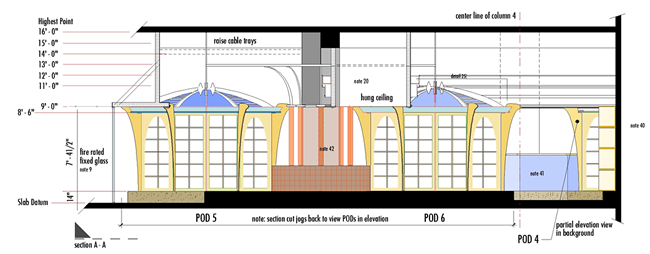 |
Section
A-A shows soffit at POD 5 with
fire-rated glass [note 9] and
hung ceiling chase for ducts and conduit [note
20]
with wood-faced stepped, sides. All surfaces
above the trim at
the 9 ft elevation, with the exception of these
sides and Armature pieces, to be painted dark-umber.
[link for sections and elevations] |
|
|
NOTE:
This project was never built. We managed to bring the cost to the client - by proposing a contribution to the hospital - in line with the fixed budget however not by agreeing to build per the protocols of the University nor we we able to absorb the prior costs of the original design work and the fees imposed for our efforts to be supervised by the administration. Nor were we able to select a contractor. We were told to use the one who had build the hospital. A fine contractor but the scale and complexity of this project certainly did not fit their circumstance of finishing such a huge project as the Children’s Hospital which was in the latter stages of finish and opening at the time. In addition, as we developed the design and its full character came out, I am sure that it seemed too extreme to almost everyone including even our client. Everyone appreciated the design yet the “risk-factor” of being associated with it must have seemed too high. This is a typical reaction in institutional settings. One of the rare exceptions, in our 50 year experience, was with both UniCredit Real estate and Permasteelisa, the contractor, on the UniManagement NavCenter. They embraced the design. With the VCH project, each successive iteration of the design, as we solved the problems presented by the space, became less conventional and more “radical.” This was not our intension, just the natural evolution of the idea. To us, who had to build and manufacture it, these were achievable complexities. To a bystander who had overall job responsibility, they certainly must have seemed “too much.” Support for the project slowly faded and as did trust between all of the parties. In the end the president of VCH, new to the job, told me that he could push the project through but that the political risk of any failure - of any kind - was simply too high. From the reality of his situation, this was not an inaccurate judgment. At the time, this would have been a big jump for MG Taylor in project complexity and size. Now, of course, it would not be, although still a challenging one. We were not able to demonstrate our capability to deliver the result to those who were accountable in an extremely conservative management structure.
One of the more bizarre aspects of the entire circumstance is that there were plenty of sources of contribution to the building fund. Nor, did anyone disagree that the true cost of the project plus the various fees and add ons did not constitute a good value. No one wanted to provide a few hundred thousand - in a 100 million dollar project - for “offices.” Everyone could see that this was a new kind of office yet the concept of office still prevailed as insignificant and not worthy of investment. This is the first time that one of our projects was rejected because of the power of the negative icon we were replacing. That this would have created, as a working reality, a new concept of office integrated with a tested, but still unique, way of working did not have sufficient sex appeal to those interested in making a contribution. In retrospect, I failed to give the president a sufficient “argument” to break this log jam of old paradigms.
The sad thing is that the president and his staff were “put back in their (conventional) boxes” denied the opportunity to relate to one another and to work an entirely new way. no one, it seems, calculated the cost benefit of even a small improvement in executive synergy and productivity.
This project cost us several months of effort and over $50,000 in expenses. It was extremely disappointing to lose it. To date, we have failed in four attempts to build a project on a major college campus - the gap between our way of working the the establishment remains too great. The VCH design remains our most mature statement of “THE OFFICE.” Many aspects of this design have found their way to reality as the pictures and commentary below shows. The full expression remains to be built. We are closer now three and a half years later.
In the end, this was a project that died from fatigue - a major risk in circumstances like existed at the time. There is a lesson in this.
Matt Taylor
San Francisco
March 27, 2007
|
|
|
|
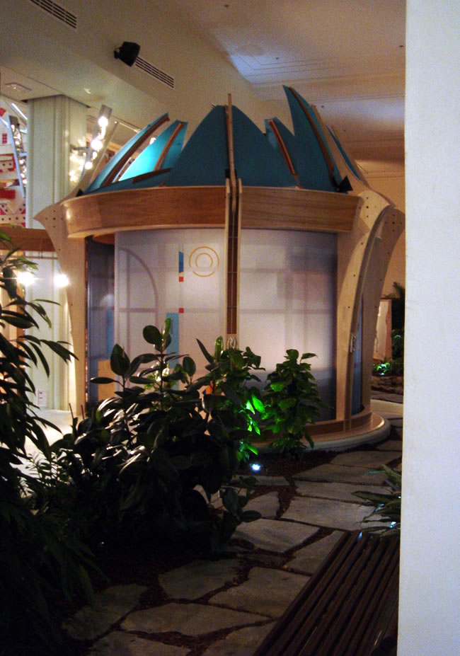
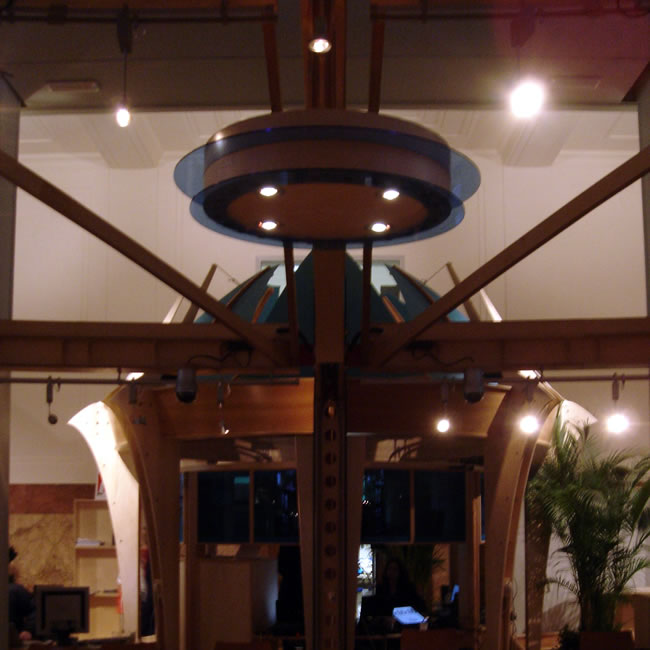
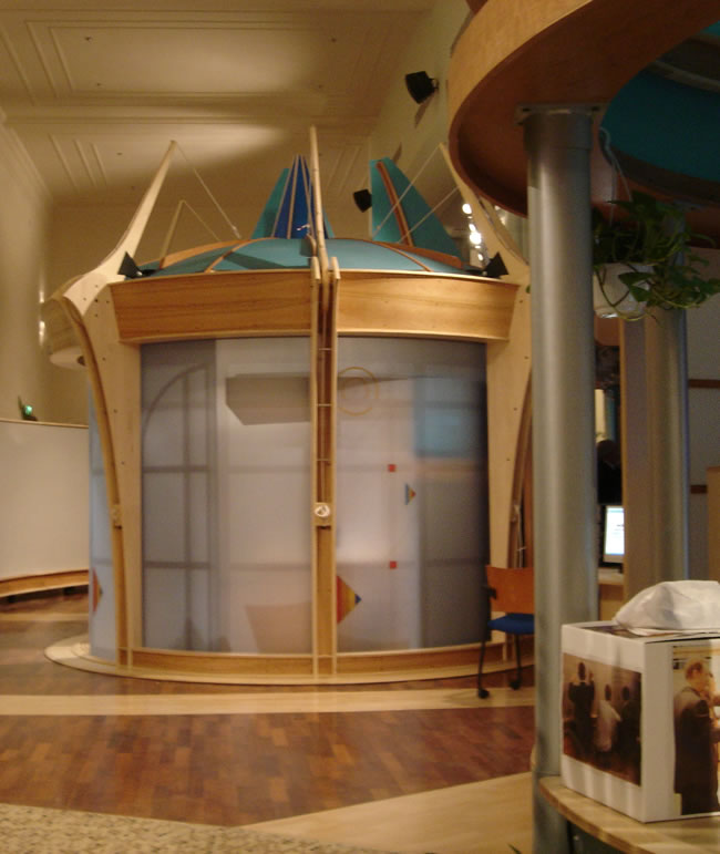
The partial realization of a dream which goes back to to 1990 [link: 1990s work]. It is the vision of an office landscape. An adaptable, environment that is a cybernetic forest [link: cybernetic forest]. The VCH landscape design is a series of interconnect workPODS in a landscape of collaborative commons, plants and tooling. The UniCredit NavCenter has fewer PODS with a much greater emphasis on the collaborative areas. However, it is possible to see how POD clusters will work, in a green landscape of multiple levels, by looking at the UniCredit photos and applying some imagination.
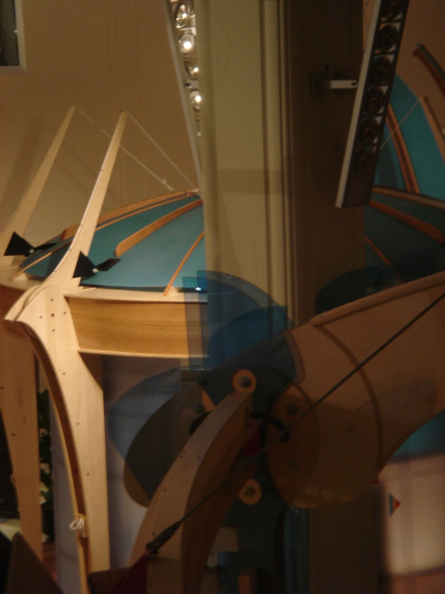
These PODs are room size. They have twice the work surface of a typical office or work station system, room for 500 plus books, a pull down table for meetings, a high storage cabinet and rolling file cabinets. All this turns on a turntable so that the view from any of the working areas can be toward any point of the compass. In dependent of this turntable are three layers of sliding screens which modulate, sight, light and sound. The top of the POD can be opened or closed one section at a time. This also effects sense of openness and enclosure, light and sound. External and internal lighting in and at the POD, as well as, the turntable screens and top pieces can be controlled by the POD User.
In the VCH layout the PODs are arranged so as to relate to one another - or not, depending on the moment to moment requirements of the users. This allows work partners to make eye contact and communicate while at their workstations or ‘turn away” for private work or open to the public commons. The UniCredit requirements were different and the PODs are farther removed form one another and there are fewer of them. They are islands of refuge in a predominately “hot” collaborative space. |
|
|
|
|
|
|
|
| So, what is significant and truly unique about the new OFFICE schema? It is the combination of several specific innovations, each important in themselves - it is the synergy of all of them which makes the quality which we are seeking. A quality almost totally lacking in the modern workplace [link: reworking the workplace]. |
|
|
|
|
| VCH
Executive Officesffices |
|
|
|
| UniCredit NavCenter Tour ffices |
|
|
|
posted:
November 22, 2003 • revised: December 4, 2003 • additional material: March 26, 2007 |
|