| An Image of Japan 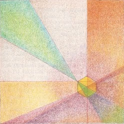
| Land of Recreation - Matt Taylor | Abscape - 1987 | | | In 1987, Gail Todd and I spent a couple of weeks in Japan. It was a vacation not a business trip. We had a wonderful time. On the long flight home, I used the time to render a Abscape that illustrated my experience. | | This study is based on the square and some of it’s various elements. The hexagon shape is, of course, the view of a cube from a 45 degree angle. The form is placed within the larger square of the “canvas” to form two squares - one large one small. Notice that they relate differently to the hex/cube creating an asymmetrical effect. The three rectangles resulting from this positioning logically follow each stepping down from the other left to right. The radial lines from the hex/cube each form a series of triangles that relate symmetrically to the framing square. | | In all, a fairly complex design emanating from one premise - the hex/square - and it’s placement within the main square of the canvas. | | The work is done in colored pencils on a mildly textured paper. I choose to let the texture come through by limiting the number of layers of color. The color palette was deliberately held to a fixed number of pencils used in different combinations in the rendering of each geometric form. | | The overall effect reinforced with the “halo” effect of the purple echo’s the Japanese flag but in a way that transforms it from the demanding geometry of the flag to a softer and more variegated statement. Placing the center of focus in the lower right hand corner instead of the upper left hand one also implies a transformation - a movement of focus and energy. Containing the energy within the square also carries a message. | | What does the piece “mean?” There are three levels that this can be addressed: the meaning of the geometry, itself; the connotation of forms and colors; and, any denotative references - in this case the flag. Each of these levels are distinct and add up to a sense that will, of course, mean different things to different people based on their experience. | | On the level of geometry, this is a study of the nature of the square and it’s transformation into the cube. The cube, as I have pointed out, rendered on a flat plane forms a hexagon. These Platonic shapes each have their own historical and connotative meanings which were generally understood in educated society up to the early decades of the last century. Still, even today, there is a general response to the square, rectangle, triangle, hexagon and cube that can be relied upon. | | Texture also conveys meaning and the relative level of texture of each of the shapes conveys a subtle nuance. | | Where things are on the “page” has significance as every advertising layout artist knows. | | The icon of the flag is loaded with meaning to almost anyone with a memory of history. | | I will leave it to each of you to apply your own meanings to these things as they form the personal basis of any interpretation. I will, however, give you my gestalt based on my overall intent. | | This was my second trip to Japan the first being in 1947 just after the end of WWII. In-between these two experiences, my knowledge of the country was limited to that provided in media and books, as well as, having owned several very fine products that were designed and manufactured in Japan. The drawing was intended to show the similarity and differences between the two visits - two snapshots in time. | | Japan, as we all know, is notable for it’s care in design, the art of paperwork, the beautiful simplicity of it’s art and traditional architecture based on natural setting and geometry - and these are just a few samples of how nature and art deeply weaves it’s way into the Japanese culture. | | In my design I wanted to show these things without mimicking any of them directly. By letting the paper show through I was referencing that craft - most of what we brought home from Japan were paper objects. The geometry, although not literal, reference the modules that determine the layout of a traditional house. The colors, again not literal, echo paperwork and the landscape. All of these hearken to the traditional Japan. The inversion and play upon the flag motif, including the different way the “rays” are position on the basic square, are intended to indicate a transformation in progress but not done. | | The overall effect is serene, meticulous, positive and with enough complexity that ever deeper levels meaning through contemplation can be found - if one looks... and thinks. This is the way that Japan is to me. There are many deep levels, but you have to look beyond the obvious, avoid the cliché, see the many overlapping elements and put them back together in your mind. In mist of a transformation, Japan - as ancient as it is - is “not done.” | | Japan, I suspect, will be the first nation state that will move beyond this political economic framework and create some kind of new structure that is coherent and geographically distributed at the same time. This is but one example of the “surprises” that may yet come from this vibrant culture. | | | Matt Taylor
Palo Alto
April 13, 2001 | 
SolutionBox voice of this document:
ENGINEER • STRATEGY • PRELIMINARY |
posted April 13, 2001
revised April 14, 2001
• 20010413.433111.mt • 20010414.994637.mt •
• 20020317.229792.mt • (note: this document is about 75% finished) Copyright© Matt Taylor 1987, 2001 | |
|